AI Art in Board Game Prototypes: What Factories Actually Need From Your Files
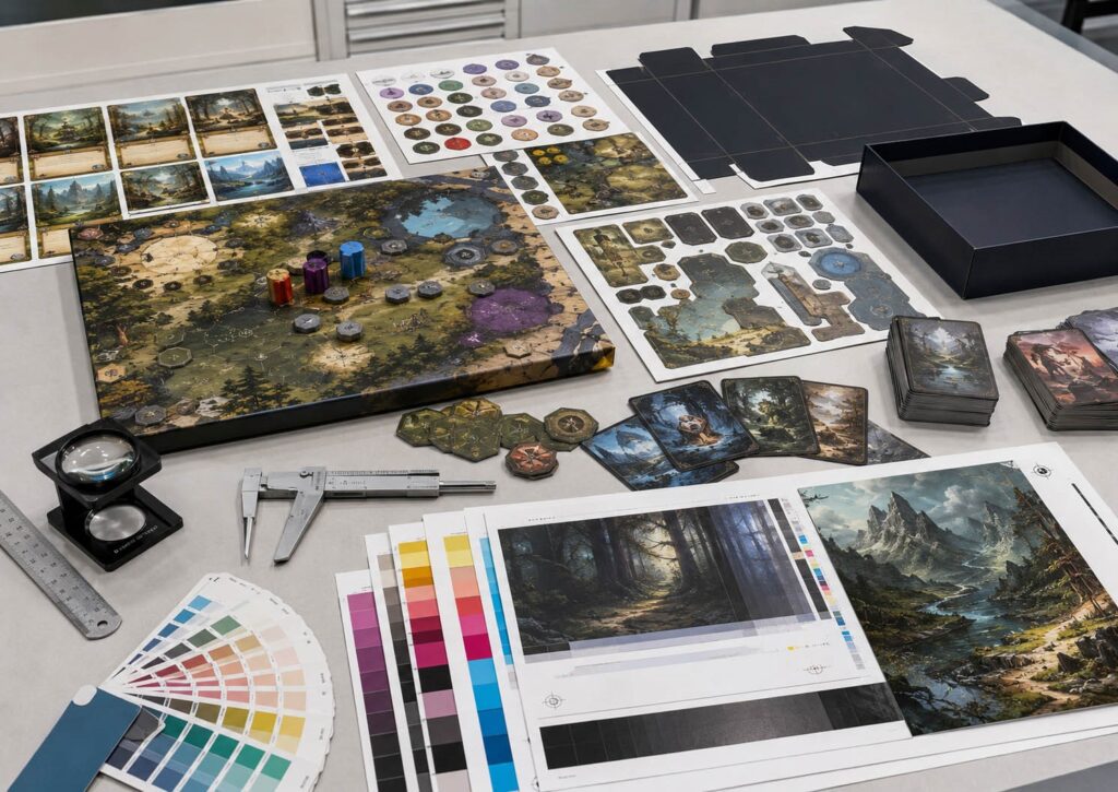
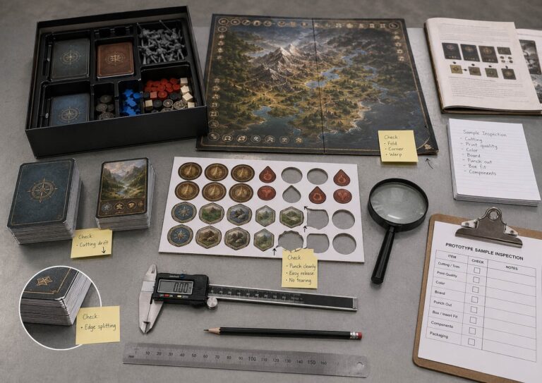
Can this file survive printing, cutting, folding, punching, packing, and real component use?
AI art can make a board game prototype look finished much earlier than it really is. That is useful for mood boards, pitch decks, character concepts, card back ideas, and early visual direction. But once the project moves into a paid printed prototype, the file is judged differently.
The factory is not asking: “Does this image look impressive?” The factory is asking the question above.
That is where many AI-assisted board game files fail. They are often beautiful, but flattened. They are large on screen, but weak at final print size. They show text and icons, but those elements are not editable. They look dark and cinematic, but the CMYK file may turn muddy. They have no real bleed, no safe area, no dieline control, and no separation between artwork and gameplay information.
A factory can print pictures. A factory can’t always take a finished-looking AI picture and turn it into a clean manufacturing file without rebuilding it.
This article is part of our 2026 series: Board Game Prototyping Problems Creators Face in 2026. The series looks at the problems independent creators meet before mass production: lost prototype options, overcomplicated designs before the first paid prototype, small-batch pricing, printing defects, dark artwork risks, and AI-generated files that still need factory cleanup before they can be produced.
The Factory Does Not Judge AI Art; It Judges File Control
The AI art debate is not the factory’s job. Some creators use AI only for internal playtesting. Some use it for publisher pitches. Some use it for Kickstarter preview copies. Some plan to replace it before mass production. Those are market, legal, community, and publishing decisions.
From a manufacturing side, the question is narrower: Is the file controlled enough to print?
That means:
AI art does not change the prototype route. It only changes the file risk inside that route.
A Beautiful AI Image Can Still Be a Bad Production File
AI images often arrive as finished pictures.
That is the first problem.
A board game production file is not just a picture. A card file, board file, punchboard file, rulebook file, or box file needs layout control.
The factory needs to know:
Where is the trim line?
Where is the bleed?
Where is the safe area?
Where does the board fold?
Where does the punchboard cut?
Which parts are artwork, and which parts are gameplay UI?
Which dark areas are mood, and which areas must stay readable?
A screenshot cannot answer those questions.
A flattened PNG cannot answer enough of them either.
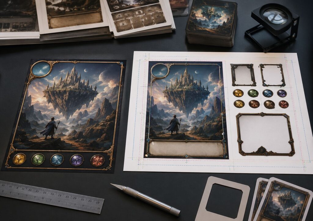
A card back image may look good online, but if the frame sits too close to the edge, normal cutting tolerance will expose it. A box cover may look dramatic, but if the artwork does not extend into the wrap area, the box corner may fail. A game board may look complete, but if the path, region border, or icon is trapped inside a dark illustration, it may become unreadable after printing.
One strong AI image also does not make the whole product ready. A board game needs repeatable visual logic across card backs, card frames, icons, token symbols, board UI, box panels, and rulebook examples. If every AI image has different contrast, lighting, border style, or icon weight, the printed game can feel unfinished even if each individual image looks impressive.
This is why we do not treat AI art as production artwork by default. It may be a good visual starting point. It is not automatically a print-ready file.
Flattened AI Files Leave Too Little Room to Fix Problems
The most common AI file problem is the flattened image. Everything is merged into one layer: background, character, texture, frame, icons, fake text, lighting, card borders, and decorative effects. That gives the factory very little control.
If the background is too dark, lightening it may also damage the character. If the text is wrong, we cannot edit it cleanly. If the icon is too close to the trim line, we cannot move it without repainting. If the border is uneven, we cannot separate it from the image. If bleed is missing, we may have to invent artwork outside the original image.
For a rough internal prototype, this may be acceptable. For a reviewer copy, Kickstarter preview copy, or small production batch, it becomes risky.
The better file structure is simple:
If the game itself is still changing every week, do not spend too much time turning every AI image into final artwork. First reduce the design uncertainty.
Final Size, Bleed, and Safe Area Are Not Optional
AI tools usually create an image inside a rectangle. Manufacturing does not stop at that rectangle. Cards need bleed. Boxes need wrap allowance. Boards need fold safety. Punchboards need die-line buffer. Rulebooks need margins. Tokens need room for cut movement.
For most printed board game components, we normally ask for around 3 mm bleed where applicable. The safe area depends on the component, but important text, icons, borders, and UI should not sit close to the trim or die line.
For cards, cutting tolerance is usually around ±0.5 mm. For punchboard tokens, front/back and die-cut alignment can often move around ±0.5–1.0 mm, depending on token size, thickness, and layout.
Those numbers sound small until they happen on a 20 mm token or a full-bleed card back. This is why AI-generated artwork with tight borders, centered icons, thin rings, or important characters close to the edge is dangerous.
The file may look finished.
But if it has no bleed and no buffer, normal production movement becomes visible.
Do not ask the factory to “just add bleed” after the image is finished. Sometimes we can extend a simple background. Sometimes we cannot do it cleanly, especially when the edge contains faces, hands, weapons, frames, logos, or symmetrical patterns.
Bleed and safe area are not export settings. They are design-stage constraints.
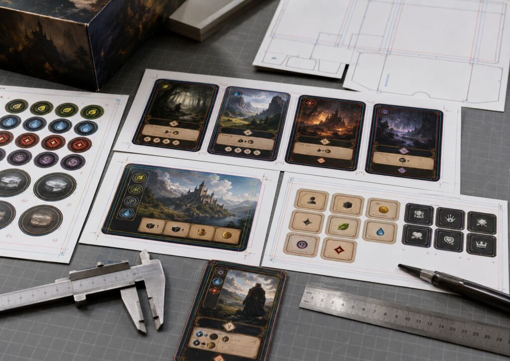
Text, Icons, and UI Should Be Rebuilt Outside the AI Image
AI can create atmosphere. It is much weaker at production UI. Board game components need readable information:
These should not usually stay inside the AI image. If text is generated inside the art, it may be misspelled, distorted, too small, or impossible to localize. If icons are part of the flattened image, we cannot easily adjust their size, contrast, or position. If card frames are inconsistent from image to image, the deck will look unstable after printing.
For production, text and icons should be rebuilt in layout software. Use real fonts. Convert final text to outlines when needed. Use vector icons where possible. Keep icon size consistent. Check readability at actual card size. Keep UI away from trim lines and die lines.
A card may look impressive in a campaign render, but at 63 × 88 mm, small UI mistakes become obvious. The test is not whether the card looks good at 200% zoom. The test is whether a player can read it at the table.
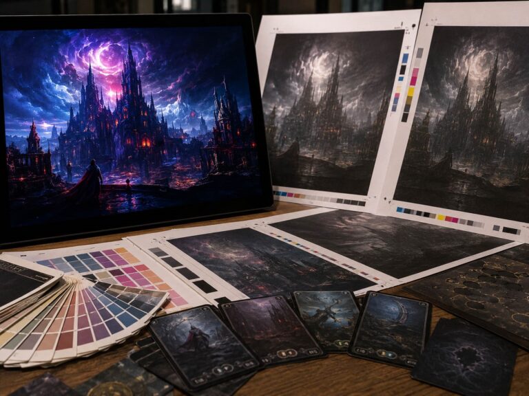
Dark AI Artwork Needs Print Control Before Sampling
AI art often loves dark drama.
Black fantasy boards.
Deep space maps.
Cyberpunk city cards.
Glowing magic on dark backgrounds.
Horror-style box covers.
These can look strong online, but they carry real print risk.
Dark AI artwork is often flattened, high-contrast, and difficult to separate cleanly. The shadows may already be compressed. The black may use too much total ink. The glowing highlights may look vivid in RGB but become weaker in CMYK. Small icons may sit inside dark texture and lose separation after printing.
For many board game printing jobs, we prefer to keep CMYK total ink coverage around 280–300% or lower, depending on paper, finish, and printing process. Once dark areas are pushed too far, the print becomes easier to muddy, harder to dry, and more sensitive to matte lamination.
If your AI art is dark, the factory needs to know which dark areas are only mood and which areas carry gameplay information. A background can lose some detail. A path, icon, number, or symbol cannot. Dark AI artwork should be checked before sampling, not after the first printed sample disappoints everyone.
AI Files Can Also Create Physical Prototype Defects
AI artwork can make physical defects more visible.
A dark board fold crack will show white fiber.
A dark punchboard token will show torn edges more clearly.
A full-bleed card back will reveal cutting drift.
A tight border will make normal trim movement look like a defect.
A low-contrast icon may disappear after lamination.
These are not only art problems. They become production problems.
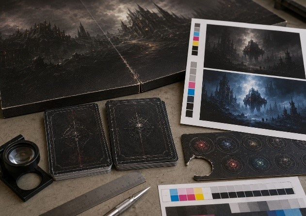
If your AI-generated card frame is too close to the edge, it increases cutting risk. If your token artwork has a tight ring, it increases die-cut alignment risk. If your board art crosses fold lines with dark solid color, the fold area becomes less forgiving.
The practical point is simple: AI artwork should be reviewed together with the component structure. Not separately. A beautiful card back may still be bad for hidden-information play. A beautiful token may still be too small to punch cleanly. A beautiful dark board may still be too fragile at fold lines. A beautiful box cover may still fail at wrap corners. The file has to survive the product, not only the screen.
What to Send When Your Prototype Uses AI Artwork
If your board game prototype uses AI-assisted artwork, do not only send PNG or JPG files and ask for printing. Send enough information for the manufacturer to judge file risk. Useful files and notes include:
Not sure whether your AI-assisted artwork is ready for a printed prototype? Download our AI Artwork Print-Ready Checklist for Board Game Prototypes before sending files to a manufacturer.
The sample purpose matters. If the prototype is only for internal playtesting, simpler files may be acceptable. If it is for reviewers, Kickstarter photography, or a paid preview batch, the files need more cleanup. If it is close to mass production, AI artwork should be treated like any other production artwork: structured, editable, color-reviewed, and placed correctly into templates.
If the quantity is already moving toward reviewer copies, convention stock, or a small preview batch, the file risk also becomes cost risk.
One Warning Before You Send AI Artwork to a Factory
⚠️ Do not send AI artwork to a factory as if beauty equals readiness. A strong image can still be a weak production file. If it has no bleed, it is not ready for cutting. If it is low resolution at final size, it is not ready for large components. If the text is trapped inside the image, it is not ready for editing or localization. If icons are too small, players may not read them. If the black is too heavy, printing may turn muddy. If the style changes from card to card, the game may feel unfinished. If the file is flattened, the factory may not be able to fix problems without rebuilding the layout.
This article is not a moral argument about AI art. It is a production warning. AI can help early board game prototypes move faster. But once the project enters paid prototype, preview copy, or manufacturing stage, the file must obey the same rules as any other artwork.
Bleed still matters. Resolution still matters. CMYK still matters. Vector text still matters. Safe area still matters. Component templates still matters.
Do not ask the factory to print uncertainty hidden inside a beautiful image.
Before paying for a printed prototype, use this checklist to review bleed, resolution, editable text, CMYK risk, dark artwork, and component templates.
If your prototype uses AI-generated or AI-assisted artwork, send us the files before locking the sample. We can help check whether the artwork is ready for digital sampling, needs bleed or layout cleanup, should be rebuilt into editable production files, or carries print risks that should be solved before a larger run.
Read the Full 2026 Prototype Problem Series
This article is part of our series: Board Game Prototyping Problems Creators Face in 2026. The series covers the main problems independent creators meet before mass production: