Rich Black and Dark Artwork: How to Avoid Muddy Board Game Printing
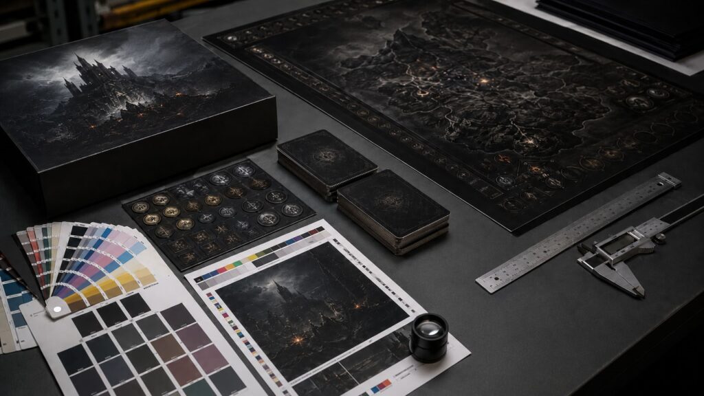
Dark artwork looks powerful on screen.
That is the trap.
A black fantasy board, a cyberpunk card back, a horror-style box cover, or a deep space map can look premium in RGB. The shadows feel rich. The contrast looks dramatic. Small lights, icons, and texture details seem clear on a monitor.
Then the printed sample arrives.
The black background looks heavy.
The shadows collapse.
The blue-black turns greenish or brownish.
The matte lamination makes everything darker.
Small icons lose separation.
The board fold or box corner shows white cracking more clearly.
The artwork still looks “dark,” but not premium anymore.
This is not just a color problem.
From a factory side, dark board game artwork is a production risk. It affects printing, lamination, cutting, folding, box wrapping, and sample approval. If the file is not prepared correctly, the factory may still be able to print it, but the result may not match what the designer thought the file promised.
This article is part of our 2026 series: Board Game Prototyping Problems Creators Face in 2026.
The series looks at the problems independent creators meet before mass production: lost prototype options, overcomplicated designs before the first paid prototype, small-batch pricing, printing defects, dark artwork risks, and AI-generated files that still need factory cleanup before they can be produced.
Dark Artwork Does Not Fail Because the Factory Cannot Print Black
When dark artwork prints badly, the first reaction is often:
“The factory printed it wrong.”
Sometimes that is true.
But many dark artwork failures start earlier than printing. The file may have been built for screen contrast, not paper. The image may still be RGB. The shadows may already be too compressed. The black may use too much total ink. For many board game printing jobs, we prefer to keep CMYK total ink coverage around 280–300% or lower, depending on paper, ink, surface finish, and printing process. Once the dark areas are pushed beyond that safe range, the result becomes easier to turn muddy, harder to dry, and more sensitive to lamination. The icons may sit inside a muddy background. The designer may be using a digital sample to judge a final offset result.
A factory can print black.
The harder question is:
Which black are we printing, on which material, with which finish, and how much detail needs to survive inside it?
That is where many files fail.
Dark artwork does not behave like white-background artwork. A small color shift on a white card may be acceptable. The same shift on a black card back can change the whole feeling of the deck. A small cutting crack on a light board may be barely visible. On dark artwork, white paper fiber can show immediately.
So the issue is not only “print darker” or “make it blacker.”
The issue is control.
A good dark file is not the darkest file. It is the file that gives printing enough room to hold shadow detail, dry properly, laminate cleanly, and survive cutting or folding without making every defect obvious.
RGB Dark Art Is Not a Production Decision
Many board game illustrations begin in RGB.
That is normal.
Artists paint for screens. Designers review on monitors. Kickstarter pages show RGB images. Social media previews use RGB. The problem starts when the RGB artwork is treated as if it already answers the print question.
It does not.
RGB light can show deep color, glowing highlights, and soft shadow transitions while can’t transfer directly into CMYK ink. When RGB dark artwork is converted to CMYK without review, several things can happen:
The file may still be high resolution.
It may still look beautiful on screen.
But it is not yet a board game printing file.
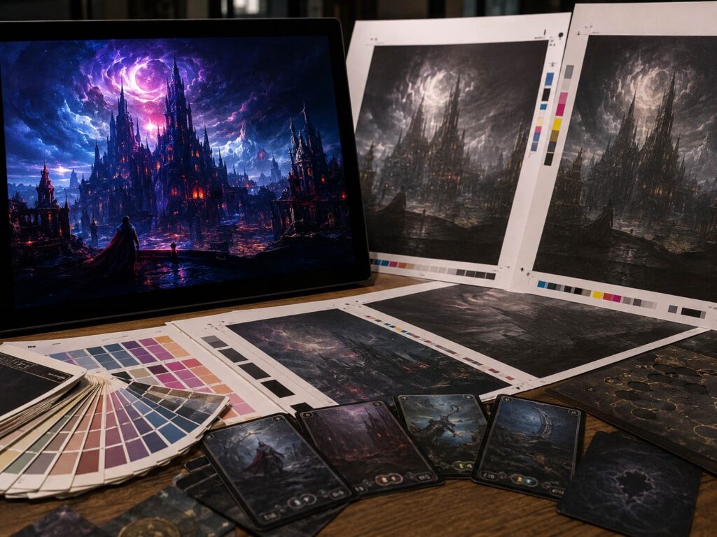
For dark board game card printing colors, the important review is not only resolution. It is whether the converted CMYK file still separates the parts that players need to see.
A dark card back with decorative texture is one thing.
A dark player board with icons, tracks, text, and state markers is different.
A dark box cover that only needs mood can tolerate more shadow compression.
A dark game board that players must read for two hours cannot.
This is why “RGB to CMYK board game art” should not be treated as a final export step at the end. It should be reviewed before the paid prototype, especially when the game uses dark boards, black card backs, or heavy atmospheric artwork.
Total Ink Coverage Is the Hidden Limit
Dark artwork often doesn’t work because too much ink is trying to do the same job.
This is not always K100 in CMYK printing. Designers often mix cyan, magenta, yellow and black together to get rich black. A typical rich black formula might be C60 M40 Y40 K100 . But that doesn’t mean that every dark area should use that formula.
The real limit is Total Ink Coverage, often called TIC.
Total Ink Coverage means the combined percentage of C, M, Y, and K in one area. If a dark area uses too much total ink, it can create practical problems:
As a practical factory rule, many dark print areas should stay under a controlled TIC range. Around 300% is often the upper caution zone, but the exact safe range depends on paper, ink, machine setup, finish, and supplier process.
That is why we do not like files where every dark area is pushed to maximum black.
A box cover may allow a richer dark background than a heavily handled card deck. A matte laminated board may need a different approach from a varnished card. A rulebook page with dark background and small text needs even more caution.
The file should not be asking the press to carry unnecessary ink load.
If the image only becomes “premium” when all dark values are pushed to the edge, the artwork is not production-stable yet.
This is also why dark artwork belongs in the prototype risk discussion. It connects with the broader sample problems we covered in Prototype Printing Defects: Why Cards, Game Boards, and Punchboards Fail.
Rich Black Should Be Controlled, Not Maximized
Rich black is useful.
It can make a dark box cover feel deeper than plain K100. It can help large black backgrounds avoid looking flat. It can support a premium board game style when used carefully.
But rich black is not a magic setting.
A common mistake is using one heavy rich black formula everywhere:
That is not control. That is flooding the product with ink.
Different components need different black behavior.
A large box cover may need visual depth.
A card back needs consistency and clean cutting tolerance.
A game board needs readable paths, regions, and icons.
A punchboard token needs edge safety.
A rulebook page needs legibility.
A small card icon needs contrast more than atmosphere.
So the better question is not:
“What is the best rich black formula?”
The better question is:
Which areas need rich black, and which areas only need readable dark color?
For large backgrounds, rich black can help. For small text, thin lines, icons, borders, and rules content, heavy multi-channel black can create registration and clarity problems. In many places, a simpler black or controlled dark CMYK mix is safer.
This is where a factory or prepress review helps.
We do not need to redesign the artwork. But we do need to know which dark areas are mood, which areas are gameplay information, and which areas cannot lose detail.
A dark background can be adjusted.
A hidden icon lost in the shadow is a gameplay problem.
Matte Lamination Can Make Dark Art Look Heavier
Many creators prefer matte lamination for its premium feel.
This makes sense.
Matte finishes reduce glare, soften the surface and make a box or board feel more serious.. But on dark artwork, matte lamination can also make the printed result feel heavier or flatter.
This is common with dark blue backgrounds, black fantasy maps, horror artwork, space themes, cyberpunk shadows, and small gold or gray icons on dark panels.
The designer approves the digital file. The printed sheet already looks darker than expected. Then matte lamination reduces perceived contrast again. The final result becomes less readable.
This does not mean matte lamination is wrong.
It means dark artwork should be prepared with the finish in mind.
If a card back uses dark texture only for mood, the shift may be acceptable. If a game board uses dark terrain, subtle paths, and small region boundaries, the same shift can hurt playability. If a rulebook page uses dark panels behind small text, matte finish can make the reading experience worse.
From a manufacturing side, matte lamination is not just decoration.
It is part of the color result.
That is why a digital screen review cannot be the final authority for dark artwork. The file, material, ink load, and surface finish need to be considered together.
Shadow Detail Must Survive at Real Size
Dark artwork often fails in the shadow areas, not in the pure black.
A monitor can show a lot of near-black information. Paper cannot always hold those differences clearly, especially after CMYK conversion and lamination.
This is why shadow detail needs separation before printing.
If the background has five levels of dark texture but all five levels become nearly the same CMYK value, the printed result will look flat. If small icons are only slightly lighter than the background, they may disappear. If a map path depends on a soft dark-gray line over a black-blue background, it may not be readable under real light.
The factory cannot always rescue that at the printing stage.
If the file has no usable separation, increasing ink or adjusting color may only make the whole image heavier.
Before printing dark artwork, review the file at actual size.
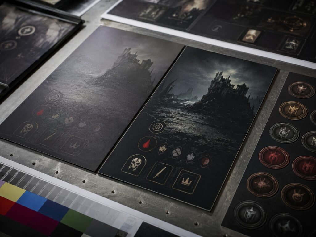
Do not only zoom in on the monitor.
Check whether players can see:
For small cards, the test should be harsher. A symbol that looks clear at 200% zoom may fail at real card size. A low-contrast UI panel may look elegant in a render but become annoying during play.
A good dark board game file should not depend on perfect lighting.
If players need to tilt the card or move closer to the table to read it, the file is not ready.
Dark Boards and Boxes Expose Physical Defects Faster
Dark artwork makes physical defects easier to see.
This is not only a printing issue.
On mounted game boards, fold lines and corners carry stress. If the surface paper cracks, dark artwork makes the white fiber more visible.
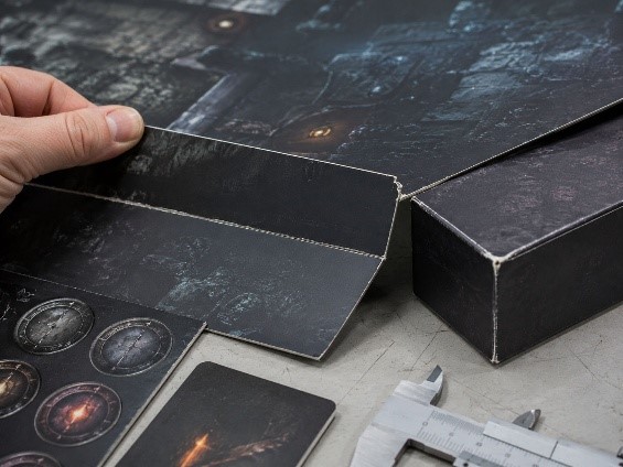
On rigid boxes, wrapped corners can show small cracks or rubbing more clearly when the cover is black or dark blue. On punchboards, a torn token edge becomes more obvious when the printed surface is dark.
This is why dark artwork should be discussed together with material and structure.
A dark quad-fold board is not just a color choice. It is also a fold-stress decision.
A dark rigid box is not just premium packaging. It is also a corner-wrapping risk.
A dark punchboard token is not just a visual style. It is also an edge-tearing risk.
A dark card back is not just atmosphere. It is also more sensitive to cutting drift.
The more premium the dark design looks in a render, the more unforgiving it may become in production.
That does not mean dark artwork should be avoided.
It means it should be planned earlier.
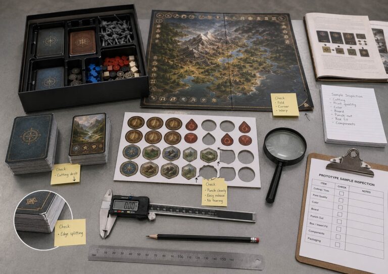
If the game depends on a dark visual identity, the prototype should check more than color. It should check folding, cutting, corner wrapping, token release, and real table readability.
A dark product should be approved by handling, not only by screenshot.
Digital Samples Are Useful, But Not Final Color Approval
High-resolution digital printing is often the practical way for prototypes and small batches.
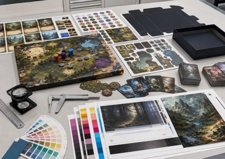
It is useful for checking size, layout, basic image placement, board fold direction, box fit, component stack, rough visual style, and table presence.
But a digital sample should not be treated as final offset color approval, especially for dark artwork.
Digital printing and offset printing may use different machines, inks, dot behavior, paper response, and surface finish interaction. A dark background that looks acceptable in a digital sample can still shift in offset production. A shadow that holds detail in one process may close up in another.
This is not automatically a defect.
It is a process boundary.
The expensive mistake is using the wrong sample for the wrong decision.
A digital sample can tell you whether the board size works.
It may not tell you exactly how rich black will behave in final offset printing with matte lamination.
A factory should explain that boundary before the client approves the sample. A client should not assume that all dark color decisions are solved just because the first sample looks acceptable.
What to Send Before Printing Dark Board Game Artwork
If your game uses heavy dark artwork, do not only send flattened images and ask for printing.
Send enough information for the manufacturer to understand the risk.
Useful files and notes include:
If your dark artwork was created or assisted by AI tools, use our AI Artwork Print-Ready Checklist for Board Game Prototypes before sending files for sample printing.
The most important note is usually not technical.
It is functional.
Tell the factory which dark areas is very important during gameplay. A background texture can shift slightly. A hidden path on the board can not. A decorative shadow on a box cover can be adjusted. A low-contrast icon on a player card may make the game harder to play.
If the artwork was made with AI tools, be more careful. AI-generated dark illustrations are often flattened, high-contrast, and difficult to separate cleanly for print adjustment. We cover that file issue in AI Art in Board Game Prototypes: What Factories Actually Need From Your Files.
For dark projects, the goal is not to make the file look dramatic on screen.
The goal is to make the printed product readable, stable, and manufacturable.
One Warning Before You Print Dark Artwork
Do not approve dark artwork only because it looks premium in a render.
Dark style is not the same as dark manufacturing control.
If the black is too heavy, the result may turn muddy.
If the shadow detail is too weak, the artwork may collapse after CMYK conversion.
If matte lamination is not considered, the result may look flatter than expected.
If small icons sit inside dark backgrounds, players may struggle to read them.
If a dark board folds or cracks, the defect will be more visible.
If a dark box uses tight wrapped corners, rubbing and white edges may stand out faster.
This article does not apply equally to every game. A bright family card game and a black-heavy horror board game do not carry the same color risk. A simple dark box cover and a dark gameplay board also do not need the same level of review.
But the warning is simple:
Do not use darkness to hide unfinished production decisions.
Dark artwork should be tested for print behavior, material response, surface finish, readability, and physical handling. If it only works on a backlit screen, it is not ready for a factory sample.
If your board game uses dark cards, black-heavy boards, rich black box artwork, or low-contrast icons, send us the files before locking production. We can help check whether the artwork needs CMYK adjustment, TIC control, safer black formulas, stronger contrast, or a different surface finish before you spend money on a larger run.
Read the Full 2026 Prototype Problem Series
This article is part of our series: Board Game Prototyping Problems Creators Face in 2026.
The series covers the main problems independent creators meet before mass production: